
Tableau challenges with pandas.
As I mentioned in the last post, right now I am working on a Tableau project with polling data from fivethirtyeight. Overall I am looking to make a time series line chart with the poll results for each candidate over time (I feel like that’s the big story, later I can add filters like how the results change depending on who’s polled, who does the polling, etc.). I’m going by the end date for each poll. Here are some challenges:
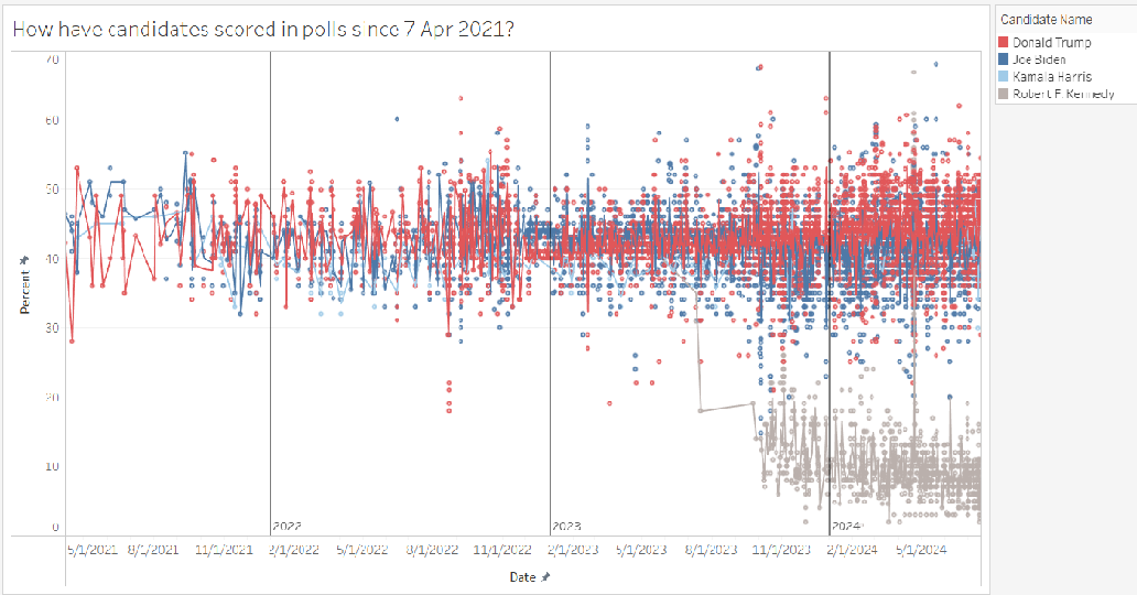
(1) Some days have several polls and others have no polls. Displaying data for all the polls looks messy, even for just a few candidates (I’m looking at Trump, Biden, Harris, and Kennedy, but maybe I’ll add a filter to the dashboard since the data includes a lot of candidates). I figured out a way to get a daily average for each candidate, it’s pretty messy, though.
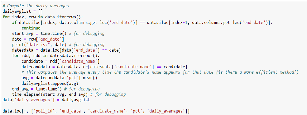
What made it challenging was that I need an average for each date and for each candidate. It would be nice to find a more slick way to do this. The code above creates a column for the daily averages, but then repeats the average for each row where there’s a poll for that day.
(2) The visualization is too busy, with or without the individual poll results displayed.
I found that I can’t extend the screen for the Tableau sheet while using continuous data, even though Tableau does it automatically when I make the data discrete. At least I can adjust the width in a dashboard, though.
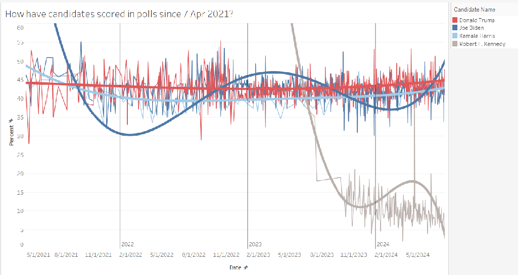
However, it would be more useful to have some sort of trendline for each candidate. Connecting the dots on the daily averages is too jagged. I tried to use trendlines in Tableau but the polynomial regression feature gives curves that are way too far off, even at degree 8, the highest Tableau will let me go. Here it is with the individual poll results removed and just the averages:
(3) Then it occurred to me, what would be more useful would be a rolling average. So how do I compute a daily rolling average for each candidate, when there are multiple rows for some days and missing rows for other days? When thinking about how to cook this up in pandas, I got the idea that maybe I could just make a second data frame with the daily averages and the rolling averages. I wanted to compute rolling averages for different sized windows and compare them, maybe even make a filter in Tableau for them. Turns out Tableau will let me use more than one data source for a single sheet, at least according to Google. Also realized, if I really wanna smooth those curves out, I need to impute the missing dates. And I believe I can linearly interpolate the missing daily averages. I think there’s literally a pandas command that does that. Stay tuned.